Lawrence van Hagen's Pop-Up & What to See in Chelsea

One of the most refreshing exhibitions in Chelsea right now is Whats Up New York the Pop Up three story show at 132 10th Avenue, curated by Lawrence van Hagen. Unfortunately I only learned of it a week before its upcoming closing on Thursday the 25th. Amazing stuff, with work shared between Americans and Europeans, most of the latter group unknown to me previously, but who made me glad to have come. For instance, the Larry Bell painting seen in the photo that includes van Hagen, is mirrored by two works by Martini Basher while the Daniel Turner reflects similarly paint slashes by Johnny Abrahams. There’s a really unusually configured Kenneth Noland and a super small John Chamberlain that appears to be in an argument with a crushed metal work by Ernesto Burgos. All in all, an exhibition worth visiting.

Another amazing show at Friedman Benda, a leading design gallery, combines cleanly carved work by Wendell Castle and wildly inventive furniture by Ron Arad, Humberto & Fernando Campana and a host of other designers that make a trip to this site fanciful fun. And at David Zwirner there is the never ending shock of the late conceptual artist Felix Gonzalez-Torres with a huge room bordered by wrapped candies and two small electric clocks as the only display on the opposing wall. At Lisson Gallery paintings by the centenarian Carmen Herrara show work from the last six years and at Matthew Marks the last work by the late Ellsworth Kelly document that he was still engaged in his work until the end.

Saw lots of other not always so interesting shows, but did want to mention Charlie Ahearn at P-P-O-W. Ahearn combines film and wall art, documenting street culture and the rise of hip hop in New York City, with videos like Bongo Barbershop and Dancing industry. There’s life in these works and he makes the most of it creatively. Just one last scene – at Allan Stone Projects there is a one man show of James Havard that is quite amazing. Without describing it I suggest you pay a visit. Havard hasn’t been seen in quite a while and I wonder why now that I’ve seen this exhibition.

There’s a lot going on in Chelsea that you will never see at the big fairs.

Curator of Whats Up New York, Lawrence van Hagen adjacent to a Larry Bell painting

Curator of Whats Up New York, Lawrence van Hagen adjacent to a Larry Bell painting

Art Fairs, From the Bottom to the Top

OTE President Dr. Elin Lake-Ewald at TEFAF in Maastrict, Holland

OTE President Dr. Elin Lake-Ewald at TEFAF in Maastrict, Holland

From Maastrict to the PierShow with little time between – that’s the way the art world can spin. My first exposure to the European Fine Art Fair in Maastrict Holland, the most beautiful and civilized art scene I’ve ever attended. There were crowds of course, but nicely mannered and for the most part smartly dressed; the food was good to taste and elegantly presented, and the dealers in the booth eager to explain the history of their wares – for three quarters of the booths presented  Old Master work and the remainder was Modern, not Contemporary.  It was an oddly smoothly experience after all the razzmatazz of the earlier weeks in Manhattan and the hustle of the latest, the newest, the most provocative.

One fascinating fact: at the Weiss Gallery booth I was drawn in by the 16th portrait of Marie de Huelstre by Frans Pourbus the Younger and got into conversation with the dealer from whom I learned that a great source of these early portraits was from the United States! Apparently when the colonists came to America the most affluent of them were accompanied by ancestor portraits (or perhaps they weren’t yet ancestors at the time). Now there is a sort of restitution – those Europe originated paintings are being brought back across the Atlantic by English dealers and finding closer connections within England and the European Union. All I could wonder was who could possibly have wanted to part with any of these portraits, even if not a sentimentalist?

TEFAF

TEFAF

On the other hand there was literally nothing in the way of jewelry and collectibles you couldn’t find at the Pier Show last weekend. Visiting that vast space on the windy water site is like landing in the middle of a thousand attics and jewel boxes spilled higgely piggely out onto the stadium floor. No Old Masterpieces to be found here, but it’s lots of fun, especially if you enjoy bargaining a bit. As noted in the nearby photos, some booths sell well, while others look as packed at the end as they were at the beginning. Most of the dealers only show at these events and hold day jobs, so for a number this is a hobby, not a profession. You may know as much as they do, so not much chance for intimidation. For the new collector, and for those who are shy about asking prices, this may be the perfect start for dabbling your toe in that swirling pond we call the Art Market.

Written by Elin Lake-Ewald


Art, Art and More Art: Armory Week 2015

Similar to past years 2015 had an intensely packed schedule of art fairs and events. The foremost of which is the Armory show itself which this year hosted 199 galleries from 28 countries around the world. Other major art fairs included the ADAA show, SCOPE, PULSE, Spring Break, Independent, Art on Paper and Volta.  Overall an excitingly exhausting amount of art, some good, some bad.

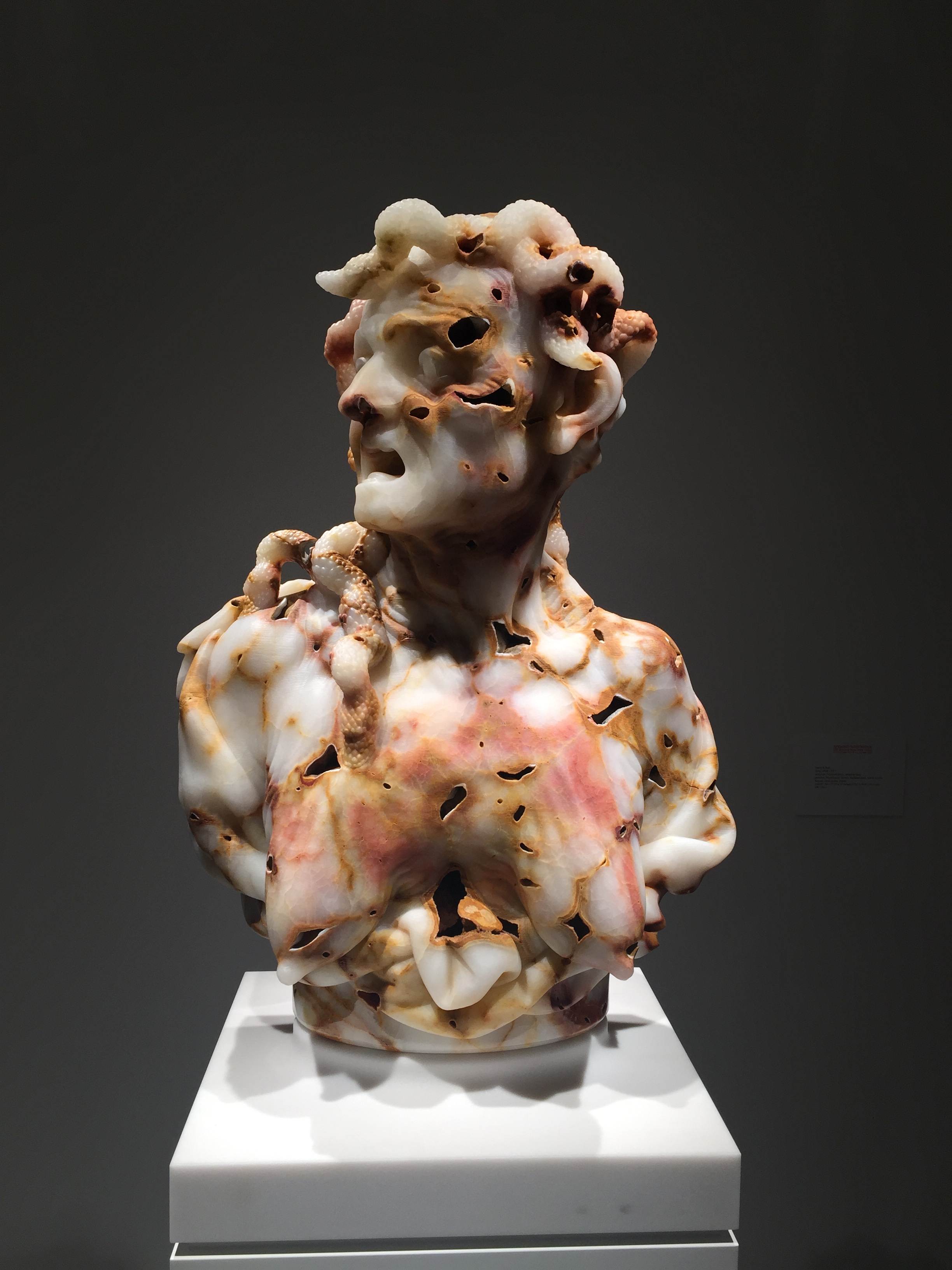
Le Rêve by Cameron Gray at Carl Hammer Gallery (Chicago, IL) - The Armory Show

Le Rêve by Cameron Gray at Carl Hammer Gallery (Chicago, IL) - The Armory Show

Detail of Le Rêve 

Detail of Le Rêve 

 At this year’s art fairs there was no shortage of whimsical pieces made of unusual materials or using innovative techniques. At the ADAA Art Show,  Armory Show, and Volta we enjoyed works with the trompe-l'œil, illusionary quality that invites the viewer to take a closer look.

This iteration of Le Rêve by Cameron Gray at Carl Hammer Gallery (Chicago, IL) is actually a skillfully composed mosaic of tiny florals. Three steps back, the eye combines them into the lyrical form of Picasso’s famous mistress.

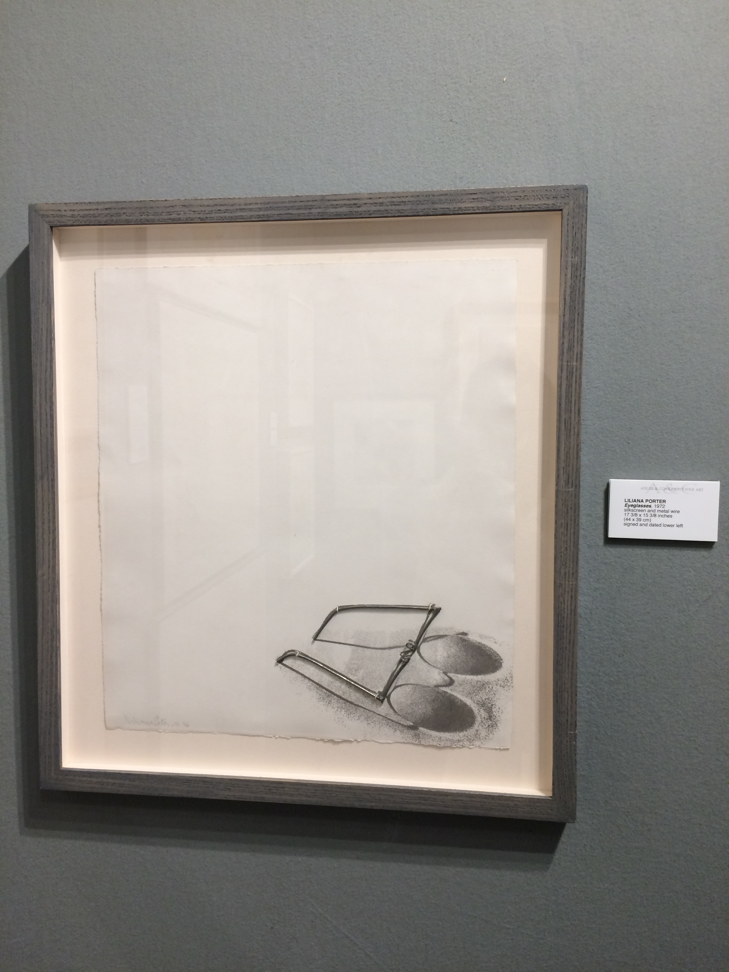
 At Adler & Conkright Fine Art (New York, NY), a quiet, clever work on paper by Liliana Porter features a wire eyeglass frame collaged atop its silkscreened shadow (in the slideshow below).  

A large and intricate geometric pattern by Leonardo Ulian shown by The Flat – Massimo Carasi (Milan) initially appears to be a web of jewels, but further examination reveals it to be a network of electrical components.

Detail of Leonardo Ulian's work

Detail of Leonardo Ulian's work

Leonardo Ulian peice at the Flat - ADAA Show

Leonardo Ulian peice at the Flat - ADAA Show

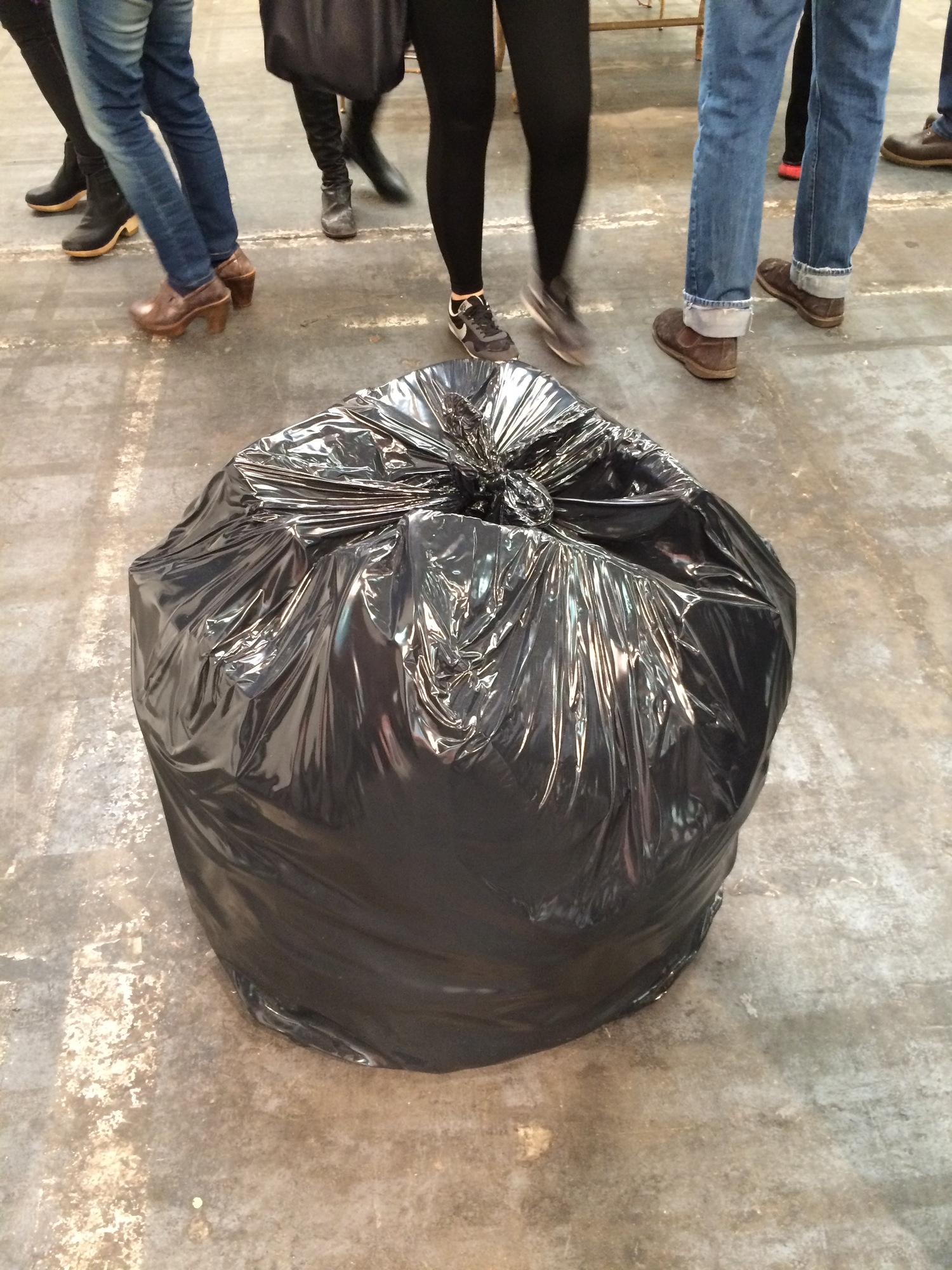
A cheekily funny work that could easily be passed over, were it placed almost anywhere besides at the center of a contemporary art collection, is Gavin Turk’s American Bag at Ben Brown Fine Arts (London) (in the slideshow below).  Looking like a jumbo-sized black garbage bag it is an interesting statement piece for home or yard. Humble as it is, the label confirms it is painted bronze.

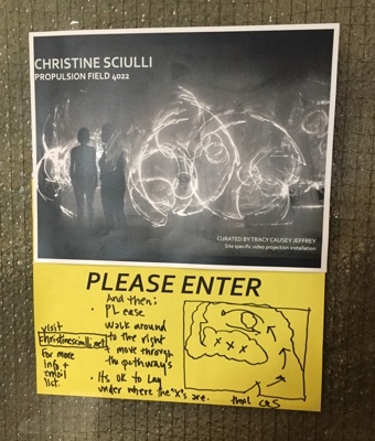
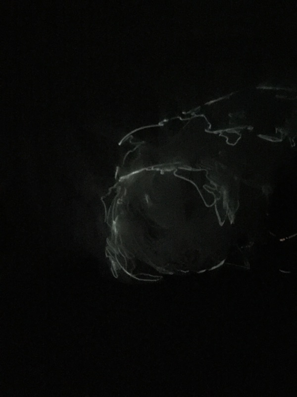
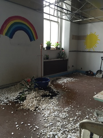
One fair that stuck out of the crowd was Spring Break. Located in a derelict post office Spring Break is a curator-driven art fair started by Ambre Kelly and Andrew Gori in 2009. Unlike its counterparts this fair is focused on installations and experiential art and is definitely a bit more rough around the edges. We loved the Christine Sciulli Propulsion Field light installation. For many it seemed like an oasis away from the other gallery driven art fairs, one that was willing to experiment and even get a little gritty. 

Exploring the Outsider Art Fair

Gaela Fernandez, Creative Growth Gallery

Gaela Fernandez, Creative Growth Gallery

Whoever missed the Outsider Art Show this year missed a lot of fun. Lots of interest and enthusiasm shown on the faces of fairgoers. Not used to seeing so much courtesy and information provided by dealers speaking with people I was pretty sure were interested but not able to buy the often expensive art on the walls. I saw one dealer giving a lot of time to students who were taking notes while a couple of well-heeled potential clients cooled their heels in her booth.  Maybe it wasn’t good business, but I liked what I saw.

 There were two notable things about the exhibition. One was the very high quality of the offerings and the other was steadily rising prices. Outsider art has moved into the big time, although the highest price I found was the $260,000 for a Martin Ramirez graphite, tempera and crayon drawing on paper, 48 x 36 inches.  AT Creative Growth Gallery, Oakland, California, there was a Judith Scott ball of twine priced at $50,000. (Currently Scott has a show at the Brooklyn Museum curated by Catherine Morris, an OTE alum). The photo, seen left, is of the woolly ball and Gaela Fernandez, the gallery’s Paris representative. Almost as much as the $60,000 asked for a Henry Darger mixed media work on paper, 8.5 x 11.75 inches from 1950, depicting a fierce looking military man.

 At Marion Harris the strange photos of dolls who are posed as children, and who look like children, by Morton Bartlett, are priced in the $22,000 range. Can I say I enjoy them but at the same time they creep me out? Well, I just did.

 What did I think was the most exceptional work in the show? Since I think it may be the closest to fine art, albeit by an untrained artist (although trained as a draftsman), the extraordinary living buildings by A.G. Rizzoli struck me as most memorable. “A Building with Mr.and Mrs. Harold Healy Symbolically Sketched” from 1937, revealed how one artist’s thinking process worked. He apparently loved the Healys because he made their elegant lofty twin towers very beautiful, while their unliked cousin was a square concrete box, and a rambunctious 3-year-old became his own structure. The artist predicted the rambunctious boy would become mayor when he grew up. While  the kid never made it he did actually run for the office as an adult. Bonnie Grossman, the director of The Ames Gallery in Berkeley, California, (see below) stands in front of one of Rizzoli’s great buildings. While this one is priced at $92,000, there are a number of smaller drawings that are in the $2,000 range.

Bonnie Grossman, The Ames Gallery

Bonnie Grossman, The Ames Gallery

 I’ve always like the work of the mysterious Gayleen Aiken at Luise Ross Gallery, her depiction of her imaginery family, all carefully named and described in detail, have always fascinated me, and their prices, $8,000 and $12,000, seem within reason for a true outsider artist.

 All in all, a show that should not have been missed by anyone who enjoys the art of the unknown by the untrained.


Feel like a bite? OTE's edible appraisals

A Mayan chief forbids a person to touch a jar of chocolate, (more than a thousand years old, via wikimedia)

A Mayan chief forbids a person to touch a jar of chocolate, (more than a thousand years old, via wikimedia)

In honor of Thanksgiving, a holiday with a distinctly foodie focus, we thought it might be fun to have a blog post dedicated to our experiences with food art.

Unsurprisingly throughout art history food has been the subject of many a painting/ sculpture/print/wood carving, and, let’s be honest every other kind of medium. Recent times have shown that it is more than just a subject. Contemporary artists have transcended merely depicting food to using it. Take Rirkrit Tiravanija’s conceptual installation/performance piece untitled (Free). Originally shown at 303 Gallery in 1992, it was recreated at MoMA as part of the Contemporary Galleries: 1980–Now installation in 2012. The exhibition converted a gallery into a kitchen where the artist served rice and Thai curry, using food as the medium with which to create art and a unique visitor experience. This piece is not alone.  In 1958 during the exhibition The Specialization of Sensibility in the Raw Material State into Stabilized Pictorial Sensibility, The Void Yves Klein served blue- cocktails to gallery visitors asking them to literally consume the artwork. Vik Muniz, a Brazilian artist is well known for his chocolate syrup drawings, one of which was of the Leonardo's ''Last Supper.” 

Chocolate

Chocolate

However, OTE has found that there are some unique challenges for owners of art using material as short-lived as food.

One of OTE’s many memorable appraisals, this case featured an artwork made of white, milk and dark chocolate and ink jet print laid on canvas. The damage was the result of a gust of wind that had caused fragile portions of chocolate to separate completely from the canvas. Sadly, the lost pieces of chocolate were not recovered. This was not the only damage the appraisers discovered. In one corner there was evidence of a mouse having nibbled on the yummy artwork. In this case the artist had intended for the work to “evolve,” which actually allowed for the loss of some of the chocolate and tampering from rodents and other animals. Less cute was the appearance of mold on other parts of the piece. The extent of the damage meant that it would need restoration, and ultimately sustain a substantial loss in value. Restoration required consolidating and re-adhering lifting/peeling areas of the material; unfortunately both costly and time consuming.

Another dilemma au chocolate involved a painting where the artist had stuck M&M’s to canvas, covering them in resin, and using them to dye the surrounding surface. Some of the M&M’s had become damaged (as seen in the picture below) and we had to determine whether this was the result of some sort of accidental damage or whether it was the inherent vice of the materials (i.e. the result of the materials themselves).  Research included some interesting conversations with a confused and curious customer service representative from Mars (the company that owns M&M). From her reaction we gathered that Mars did not often get questions like: what is an optimum temperature for an M&M? How long does the dye on an M&M last? How long would it take an exposed M&M to deteriorate, and what would this be if say the M&M were covered in, hypothetically, something like resin?

Detail of the damaged work

Detail of the damaged work

What we found out was that once you open the bag, Mars pretty much doesn't care what happens to M&M’s and really doesn't like to speculate. What could be extrapolated was that in the bag M&M’s should be stored at around 70 degrees in a cool dry place and that when exposed to heat M&M’s were likely to deteriorate more quickly. Probably, the Mars rep grudgingly admitted, it wasn't a stretch to say that M&M’s were indeed likely to deteriorate naturally over time, even when covered in resin. Following this data collection process, and our examination of the piece it was determined that it was the inherent vice of the M&M’s that was responsible for the loss. Mice, it seems, were not as industrious as our previous case had led us to believe.

If you choose to own something as wonderfully transient as art made with food, expectations of the work should follow accordingly. You may have to face the fact that something wants to eat it.


What to Look for When Collecting Photographs (part I)

"A True Photograph need not be explained, nor can it be contained in words" - Ansel Adams

While this holds true in the visual appreciation of a photo, when purchasing at auction you may want to be a little more loquacious. At a lecture in conjunction with Heritage’s October photography auction in New York City, OTE staff picked up some tips for collecting photographs. Rachel Peart, Heritage Director of Photography and Alice Sachs, the President of Art + Business Partners and an avid collector of photography, stressed a number of elements important for buyers to evaluate, whether purchasing from an auction or private sale.

The market for photography has remained relative stable over the last couple of years and as of June of this year ArtTactic reported the overall confidence in the market increased by 9 percent. Sales at auction have also increased. The Modern Photography market saw a 22 percent increase and the Vintage photography market had a particularly large increase of 125 percent, while the market for Contemporary photography remained the same from 2012 to 2013 (ArtTactic Photography Market Report January 2014). However, it is the Contemporary market that continues to drive sales at the top end. Prices for iconic photographers (i.e. Man Ray and Alfred Stieglitz) can get into the hundreds of thousands of dollars while a large percentage of sales are affordable, under $10,000.

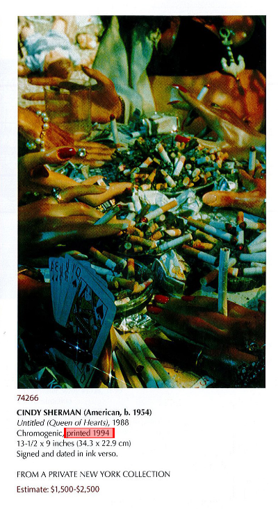
The photography market is a tricky one. Collecting is often motivated by rarity and personal aesthetics, which makes paying attention to a photograph’s catalog description key.  This may seem basic, but interpreting how a photograph’s print date and the print type relate to an artist’s market is more confusing than it looks.  In a typical description of a photographic lot at auction there is the artist’s name followed by the italicized title and a date (in red in the example). This represents the 'negative date' – the date when the photographer took the image. 

Example of a catalog description from the Heritage October 16, 2014 Photographic Auction

Example of a catalog description from the Heritage October 16, 2014 Photographic Auction

Example of a catalog description from the Heritage October 16, 2014 Photographic Auction

Example of a catalog description from the Heritage October 16, 2014 Photographic Auction

The actual date when the photography was printed is usually found either next to or as a part of the type of print (gold star above). For the Bernice Abbott photograph above “Vintage” is the only indication of when the photograph was printed. Some photographs, like the Cindy Sherman photograph on the right, are accompanied by the exact printing date (also in red). The print date informs a collector about how the specific photograph fits into the timeline of an artist’s body of work. The context of a photograph produced significantly later than the negative date is different than one printed close to when the photograph was originally taken and is a variable to be taken into account when purchasing.

Here is a guide to non-specific print date references:

  • Vintage Print: printed within five years of the negative.
  • Early Print: printed within ten years of the negative.
  • Later Print: printed at least ten years after the negative.
  • Modern Print- printed many years after the negative.
  • Posthumous Print: printed after the death of the artist.
  • Contemporary Print: currently being printed.

How much the date of printing matters in the valuation of a photograph depends on the artist. Bill Brandt’s (British, 1904-1983) later prints are darker and are valued differently than his early prints. Some descriptions will specify the person who printed them. If someone other than the artist printed the photograph it can have a strong impact on value; positive or negative, depending on their relationship with the artist. Photographs by Ed Weston (American, 1886-1958) printed by his sons are considered valuable because they were trained by him and followed his methods, but if the photographs were printed by another party this would likely not be the case. The type of photograph (the process used to create the print) is a variable that should not be overlooked.

The most common types of photographs seen at auction are:

  • Gelatin Silver: a black and white print made from 1870s to the 20th century.
  • Chromogenic prints: (also referred to as C-prints) color prints made since 1940.
  • Dye Transfer: color prints made since 1928.
  • Digital prints: (also called Digital Inkjet prints) a printing process developed recently.

In looking at the type of print it is helpful to know an artist’s typical practice. While rarity is often a positive attribute, this is not true in all instances. Ansel Adams is well known for his gelatin silver photographs in black and white and though his color photographs are rarer they are not as well received at auction. Aesthetic considerations aside, successful purchasing decisions are often based on understanding what specifically to pay attention to for an individual artist.

This blog referenced information from:


Chelsea Art Walk 2014

Last night OTE’s team took advantage of the late gallery hours in Chelsea. Below are a few shows and works we found most noteworthy.

We all enjoyed seeing Tara Donovan’s enormous installation pieces at Pace Gallery.

In this work, the millions of acrylic pieces create a mesmerizing shimmer. The form recalls a fluffy puppy. A reaction to Jeff Koons, perhaps?


Dr. Elin Lake-Ewald thought that Pierre Dorion’s trompe-l’œil paintings at Jack Shainman Gallery were riveting – about the best examples she saw on the walk.

Meanwhile, Dr. Ewald found it not altogether surprising that most of the larger galleries closed on the Chelsea Art Walk last night. The art explorers wandering the streets, from 19th  to 26th, didn’t look quite up for a $30 million Christopher Wool or a $50 million Koons production. It was for the most part  the medium sized and smaller galleries who opened their doors (and occasionally their wine bottles), to the Gen X crowds.

The galleries we checked out for the most part had wall works (and sometimes floor works) in the $10,000 – $25,000 range. A well-thought out way to attract potential investors in art.  If a collector has the ability to pay just about anything for what he wants in his home(s) he can visit those spaces any day any time. Or send his art advisors. He doesn’t have to wait until working hours are over. Great strategy. Good show.


Julia Plotkin was intrigued by Nick Gentry’s paintings on mosaics of old floppy disks at C24 Gallery:

and by John M. Armleder’s mixed media glitter-covered paintings at Galerie Richard:


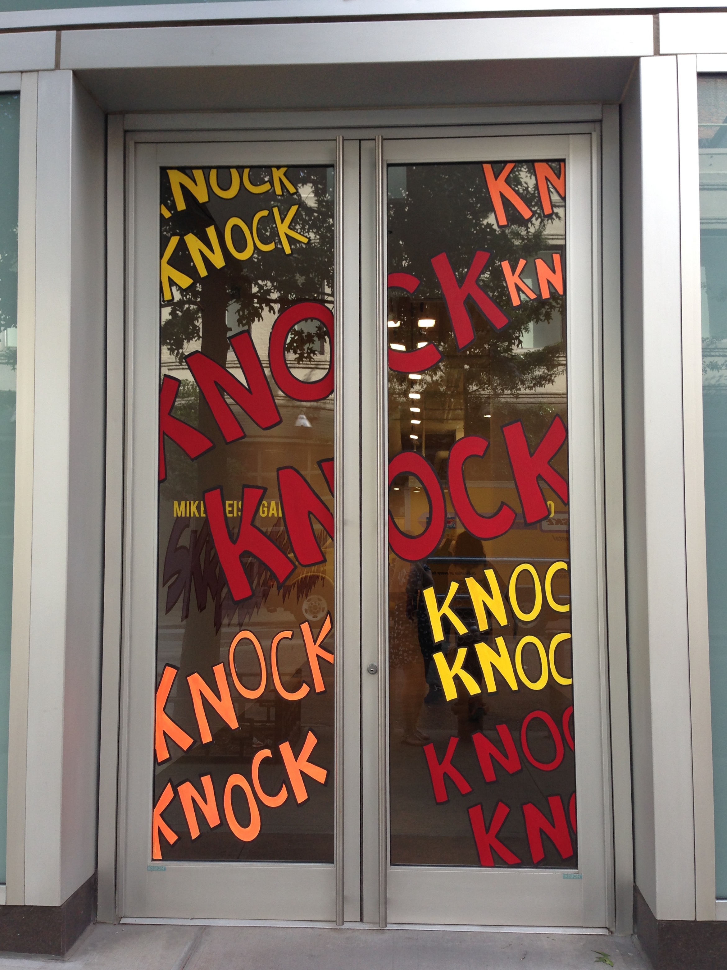
and also by Jerry Kearns’ wall paintings at Mike Weiss Gallery. Whoever buys one has the artist’s studio team come and repaint it in their space, à la Sol Lewitt.


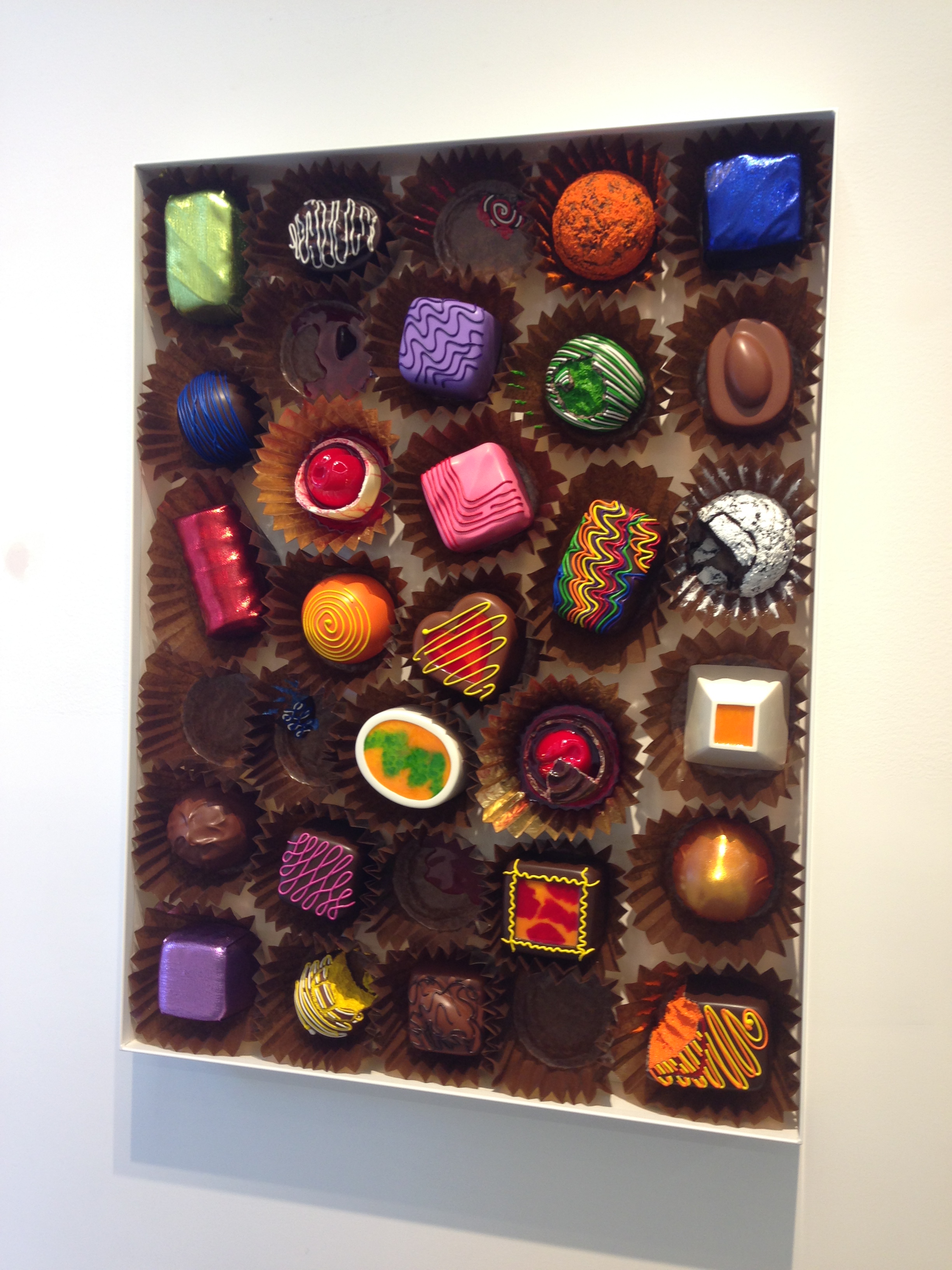
Most of all, Julia loved the fare at Unix Gallery, which offered a box of chocolates by Peter Anton and a lollipop by Desire Obtain Cherish:


Alanna Butera’s choice for the best curated exhibition goes to Procedural Portraiture at Caroline Nitsch Project Room. She was captivated by the intimate interaction between each artist’s exploration of faces, and the different use of media and line to reveal the inner essence of the subject.

Walking into Franklin Evans’ paintingassupermodel at Ameringer McErny Yohe, she was immersed into the artist’s mind and his artistic practice. The walls and floors were adorned with tape, digital prints and photographs.


As the sun set, however, the galleries closed their doors and the OTE team headed home.


July 2013 Chelsea Gallery Tour

Not easy on the feet to make the rounds of Chelsea in July as heat waves radiate from the hard cement streets. You want to linger longer in the air conditioning of the galleries, but that’s no way to make the rounds if you’re aiming for about 20 stops before you succumb to rising temperatures and your endurance flags.

I’ve waited a few days to recount my visit and in the interim have forgotten most of the exhibitions I saw – attributable to either lapsed memory or lapsed interest. What stuck in my head?

Wolf Kahn at Ameringer/McEnery/Yohe for one. At 85 he’s more than had his chance to get it right, and in many ways he does. One of the best pastelists practicing today, Kahn’s lushly vivid scenes literally grab the viewer’s attention and holds it by its decorative color. Not great, but good art by a serious artist.

Kind of interesting, although slightly dated in it depictions of very old, proudly wrinkled survivors of the Cuban Revolution superimposed on the antiqued walls of that city. Shown in Cuba, as well as across America, the paintings combine the images with writings and evokes a sense of intimacy shared with people the viewer will never know. The show is at Bryce Wolkowitz Gallery.

Not going to say where, but saw two identically themed exhibitions that were take off by younger artists on famous images of Modern Masters. But in these cases, why?

Leslie Tonkonow always has interesting shows. This one, of 20 color photo images depicting men, women and children in the middle of absolutely nowhere at night in the glare of a pinpointed light source, in this case a powerful flashlight. The effect is slightly weird, strangely riveting, rather scary.

The kind of show that always gets me – amateur photos of “The Flight Attendant Years: 1978-1986,” at Lombard Freid Gallery. It’s exactly as described. A male flight attendant photographs his friends and fellow flyers in various combinations (not pornographic but friendly), and somehow allows the viewer to for the moment step into the past when flying was fun, both for the attendants and for the passengers.

A most satisfying visit was to Paula Cooper Gallery to see an exhibition of that very fine photographer, Eliot Porter’s vintage prints, both black and white and color – dye-tranfers. I’ve always thought of Porter as a naturalist who loved to photograph trees, but this show is much more and much greater. Much to be admired.

At Klemens Gasser and Tanja Grunert (about to move to the Lower East Side) a show called “October 18, 1977” caught my eye. Based on Gerhard Richter’s 15-painting cycle about the imprisonment and finally the end of the Baader-Meinhof West German terrorist gang from the 1970s, the commissioned artists riff on the master’s version. This goes back to what I was writing about young artists utilizing directly the work of their predecessors. It’s always been done, but does it have to be so literal? Where are the original ideas? It’s not possible that in the artworld we’ve used them all up, is it?

Please don’t answer that.

June 2013 Chelsea Gallery Tour

The season may be winding down according to the calendar, but there’s still a lot of life left on the art scene.

It may be because there are so many artists and so little room in which to fit them. That is why group shows were invented. I saw so many on Saturday that I no longer remember where they were as I wandered the crowded streets of Chelsea, packed with tourists (I always figure if they are overweight and in shorts they are tourists) and art students. The buyers were probably in the Hamptons which accounted for the absence of directors in situ.

I take that back about not remembering group shows – there was “5 Rooms” at Robert Miller Gallery that included Yayoi Kusama with a paint decorated upright piano in red with her overall obsessively repeated decorations in black and white.

This is in no way a sequential tour since I just dumped the press releases for the shows in my MZWallace (designer married to David Zwirner) bag and they were scrambled when taken out this morning.

There were a few surprises, at least to me, at the Luhring Augustine exhibition of works by Philip Taaffe who used to be such a straight lines and bold dark color guy just a few years back. Now he is into gestural painting with hand-drawn relief plates, linocut printings, gold leaf and marbeling, with sources from around the globe which he has traveled a lot. Almost as much a jolt as when Stella went from minimalist work into phantasmagorical. There was a lot more fantasy at the Pace show of Tim Hawkinson, but the gallery wasn’t handing out handouts so I can’t give you the names of the pieces.

Leila Heller always has something interesting to see. This time it was something called “The Consumption” by Negar Ahkami, which is basically a bunch of scared figures being consumed by whirling blue tsunami waves of destructive force. She also showed twisted rugs by Faig Ahmed, oddly disturbing weavings of distorted carpets that at first seem standard but after a second look you realize there’s something crazy about them.

What made the tedious cross town journey to Chelsea totally worthwhile was my visit to Galerie Lelong where there was an extraordinary exhibition of the late works (1981-85) of Ana Medieta that included a segment from a documentary film currently in post-production about the artist’s fellowship and residency at the American Academy in Rome. There was also a film depicting earthen silhouettes of the artist’s body in a landscape in which gunpowder is ignited and which are related to her floor sculptures, similar to those she created in the landscapes of Cuba, Iowa and Mexico. This was the 9th solo exhibition of Medieta’s work at Lelong. I wondered that there was such a trove to show since the artist’s death was so untimely.

There was a beautiful exhibition of Linda Stojack’s paintings – the operative word being “beautiful” because the artist’s evocative images latch on to your imagination with their lush palettes, half formed images and striking lines. It’s old fashioned expressionistic painting with a contemporary twist. At the same gallery was the powerful work of Bruno Romeda, an Italian artist who deals with simple forms in a complex way.

Maybe I was tired by then, or maybe it was hard to get out of the way, but the rope sculpture of Specer Finch at James Cohan Gallery almost got me. This site-specific installation called “Fathom” (a measure six feet in length used to measure to depth of water) is composed of a very, very long (120 feet) twisted heavy rope to which are attached paper tags and swatches of color that the press release says may “best be considered a drawing of Walden Pond.”

At Andrea Rosen Gallery there was more conventional unconventional art in the form of Wolfgang Tillmans’ 11th one person show that consists of works selected from a four-year project begun in 2008 and includes a wall of 128 pages from Tillmans’ newest book Fespa digital/Fruit Logistica.

At Bruce Silverstein’s was Rosalind Solomon’s exhibition that drew crowds – “Portraits in the Time of AIDS, 1988, which brought in groups led by lecturers. It was too crowded to wait and figure out how the talks were conducted but it might be worthwhile to return on a quieter day to review this award winning photographer’s third gallery show.

There were multiple other exhibitions to remember from last Saturday, but it’s not possible to skip three – “Landscape Painting in the Civil War Era” at Driscoll Babcock, New York’s oldest art gallery, taken from the gallery’s holdings of Hudson River School paintings. Refreshing to see these old friends like Blakelock, Durand, Inness, Kensett and Fitz Henry Lane (gave his name in full because just writing ‘Lane’ won’t do it).

At Friedman Benda the first solo gallery exhibit in the United States starred the Campana Brothers’ “Concepts,” a really unusual body of cowhides that include a wall-mounted bookshelf, table, and standing shelf; a “Racketz’ collection of chairs and a screen in vent brass with nylon stitched base and hand-stitched motif made from remnant Thonet chair backings, A cabinet made out of tanned and leathered skin of the world’s largest fresh water fish and a sofa and chari created out of a series of life-like stuffed alligators. Naturally the brothers are from Brazil. The editioned alligator sofa is $90,000.

Really tired now so I’ll wind up with a visit to Gagosian Gallery where I took in two outsized Venus sculptures in polished stainless steel, polychromed Hulk statues, a black granite Gorilla, a humongous balloon swan, rabbit and monkey of monumental scale, standing huge and gleaming in a light filled huge cavern at the rear of the gallery. Koons sculptures are always flawlessly executed and shiny. One tiny finger print would throw the whole show out of kilter. There will have to guards galore at the Whitney Museum when it presents a major retrospective of his work in 2014.

Okay, quickly, what else did I see? “Chasing the Light,” Deborah Dancy’s oils on canvas at Sears-Peyton Gallery Jannis Kounellis’ classically composed installations of coal, wool, iron, glass and stone, mixed with personal articles like overcoats, shoes and hats at Cheim & Read; small dreamlike paintings by John Lees at Betty Cunningham Gallery, and finally, Christopher Evans’ clearly delineated landscapes at Fishbach Gallery.

Whew! I had no idea I had gotten around so much in just a few hours, and still had time and shoes enough to get uptown and shop. It just proves that even though those who pass for fashionable in this city absent themselves (or never leave their air-conditioned apartments) on weekends it doesn’t mean the city dies. Museums are still open, galleries still operate, artists still work, dealers still sell. So much art, so little time.